What is this project about?
The goal of this project is to take an existing print design, found in the real world, and redesign it. The goal is to improve the design clarity, solve some issues, make it look better and make sure it’s effective. It needs to serve its purpose properly. During this project, we had to communicate with our teacher just as we would with a real customer.
My design decisions
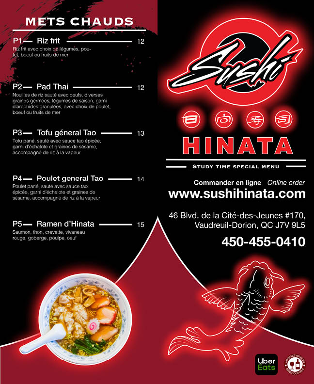
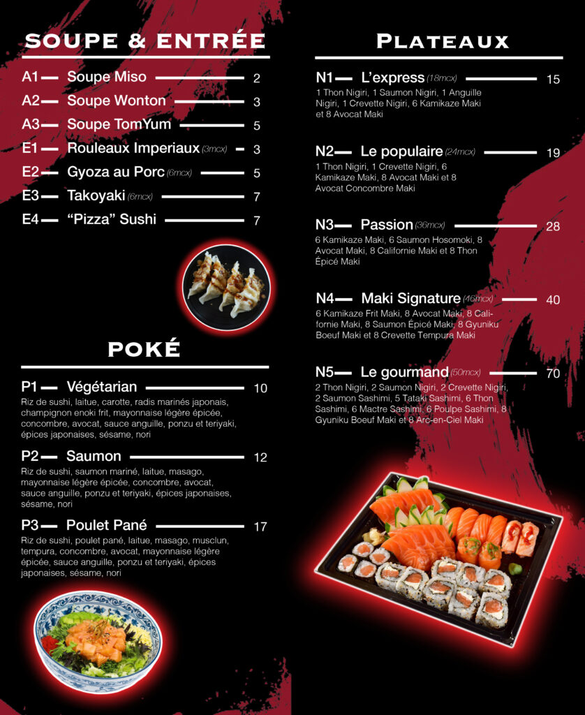
To begin with the print design that I decided to work on is the takeout sushi menu from Sushi Hinata in Vaudreuil-Dorion. My teacher and I agreed that I should do a shorter version of the menu. Considering this we therefore acted like the client asked me to create a custom menu for students. I first provided three different sketches for three different concepts. First, a nightlife in Japan concept; then, a variant of the nightlife concept that incorporates a geisha; finally, a more rural, traditional Japanese concept. The client ended up selecting the first and third concepts to develop further. The original design included a photo of each menu item. In sum, it was really busy and made it impossible for the eye to focus on the different information.
For the first concept, I played around with a “neon” look and incorporated a few elements found inside the restaurant (paint strokes, a carp, etc.). I gave bold, all-caps text to all the subcategories of the menu and a more simplistic sans-serif font for the menu items, Next, I chose to have only one photo per category, which allowed me to give more space to the text. The logo chosen for this concept was found on the outside of the restaurant building. It felt more modern and adapted to the concept.
For the third concept, I went with a white or pale beige background with all black text. I used the company’s main logo for this one, as it represented the chosen traditional look . I kept the geisha because I feel like it’s the perfect element for this more authentic Japan look. No items would have a neon effect on this concept. On the actual menu, I decided to use a bold, all-caps font for the subcategories and, once again, a regular sans-serif font for the items and descriptions. Afterwards I chose to use only one vector drawing of one of the items per subcategory for this version to give a cleaner, less crowded look that looks a bit more like it could be a menu from an old sushi shop in Osaka.
Finally, the client ended up picking the first concept. After a few rounds of back-and-forth feedback, we ended up with this result. I’m particularly proud of what we ended up with.